PPAI Ascent Branding Exploration
Look & Feel | Branding | Use Cases
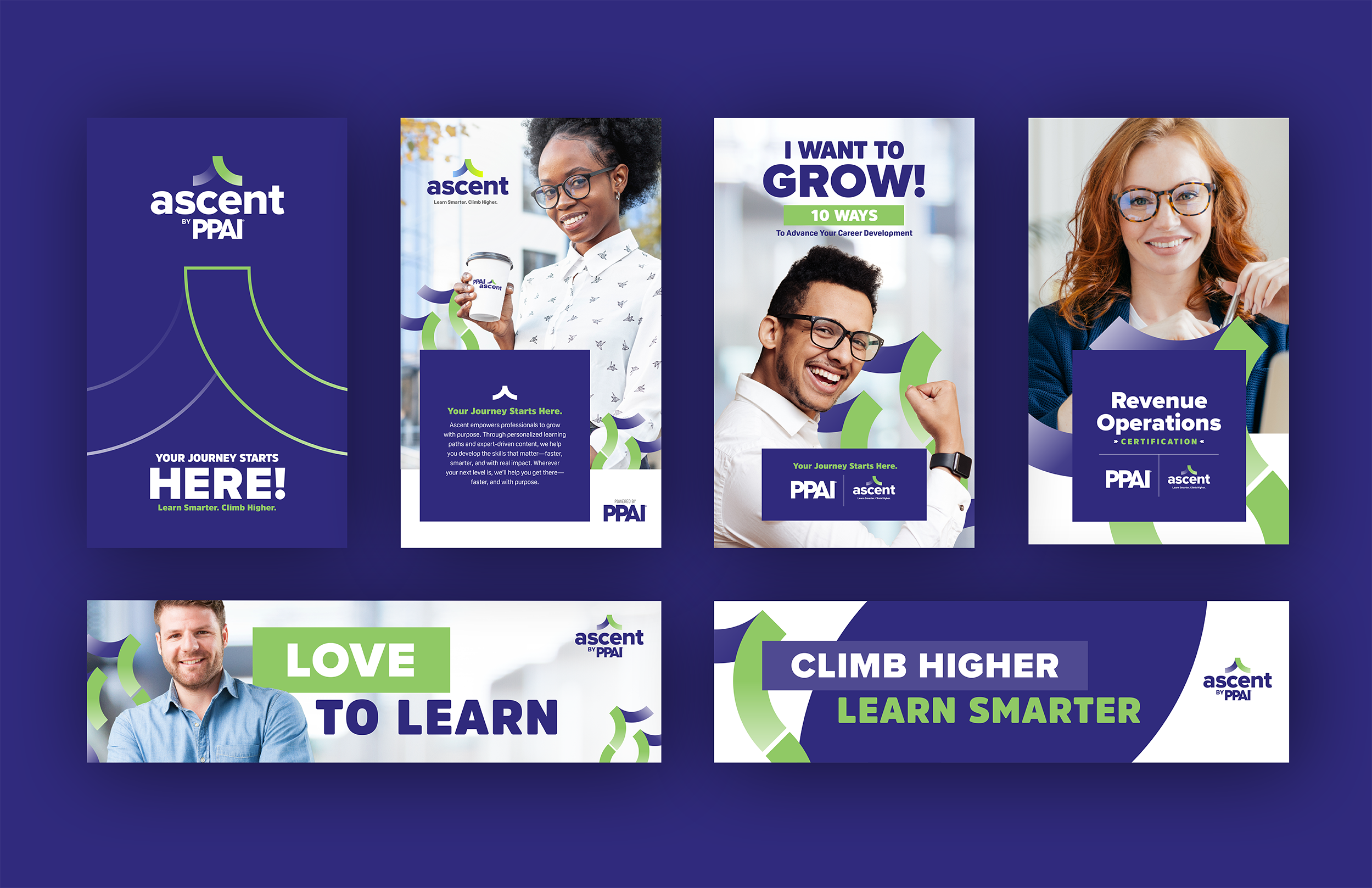
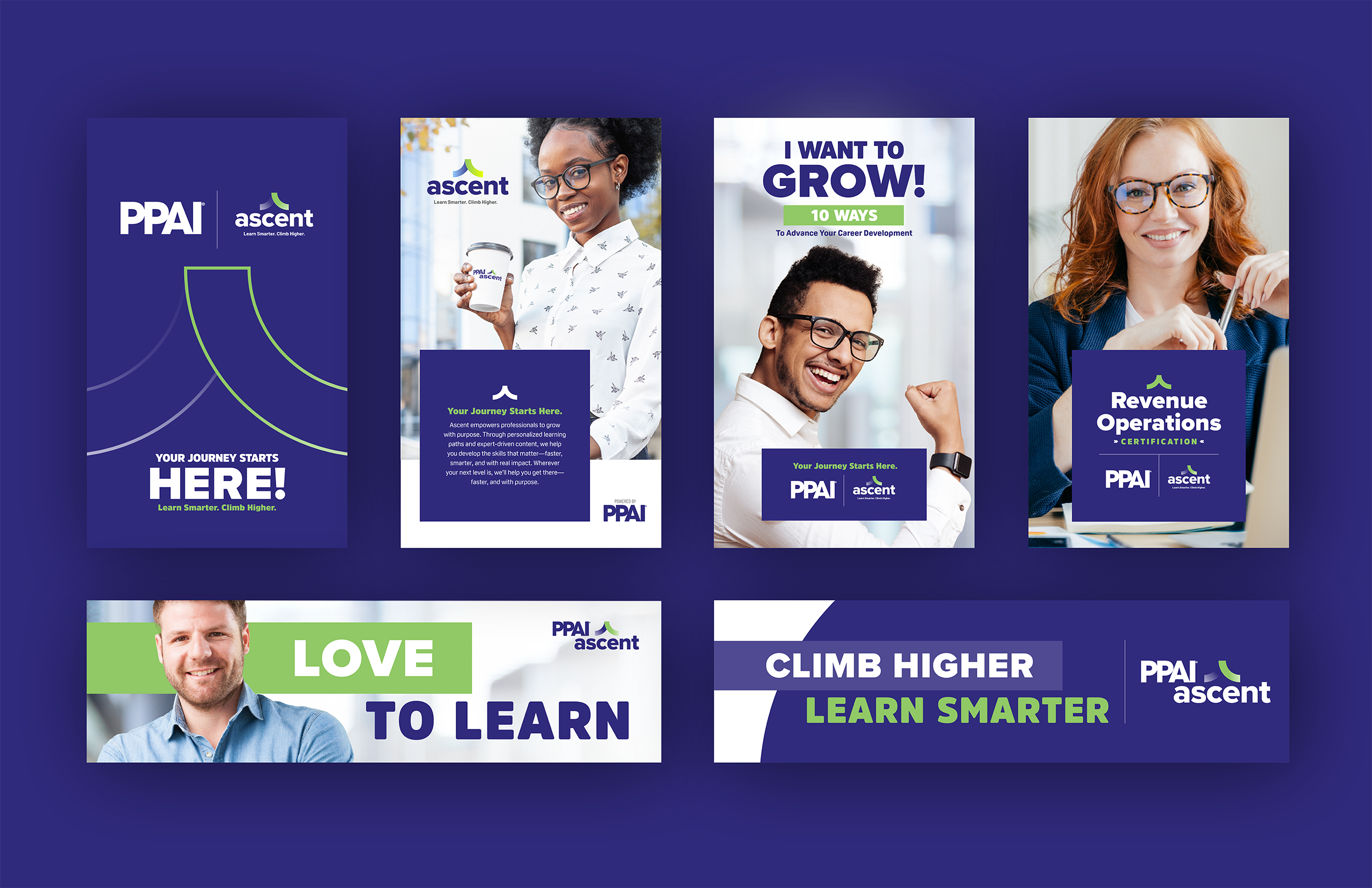
A logo and branding exploration for PPAI’s continuing education module—kept it bold, clean, and still in the family. The peak? That’s the ascent. The patterns? The journey (always pointing up, because subtle metaphors are overrated). Mocked up a few applications to show the system’s legs, with room to evolve into tracks for Marketing, Sales, Tech, and beyond.